
Right to Left Languages: Display, Translation, and PDF
You're at a rental counter or hotel desk, your phone is open, and the person across from you is waiting for one clear thing, a document they can read without guessing. If the translation on your screen looks scrambled, the names and dates seem to run the wrong way, or the fields no longer line up, the document stops being useful right when it matters most.
That problem isn't cosmetic. It's the difference between a translated licence that a clerk can verify and one that forces a second conversation, a manual check, or a refusal. For right to left languages, the layout, the script, and the direction of embedded numbers all have to work together, or the translation looks presentable but fails its real job.
Table of Contents
- Why Right to Left Languages Matter When You Travel
- What Right to Left Languages Actually Are
- How Bidirectional Text Behaves
- Why Native Script Beats Transliteration
- Digital PDFs vs Printed Booklets in RTL
- Five Signs a Translation Is Truly RTL Ready
- Choosing a Translation Product That Renders RTL Correctly
Why Right to Left Languages Matter When You Travel
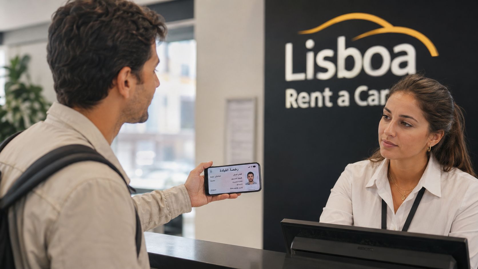
The failure usually starts at a rental desk, because that's where people discover that “translated” and “usable” are not the same thing. A traveler in Lisbon may hold up a phone showing a driver's licence rendered into Arabic, but the field labels overlap the values, the date sits in the wrong order, and the clerk can't tell what belongs where. That's not a rare edge case, it's the kind of problem that appears when software treats Arabic or Hebrew as a text swap instead of a writing system with its own reading direction and shaping rules.
A Moroccan police checkpoint, a Tehran hotel desk, and a car-rental counter in Europe all need the same thing. The person reading the document must see native script, clear labels, and numbers that remain readable inside the translated block. When that doesn't happen, the issue isn't styling, it's comprehension.
Practical rule: If the target reader has to mentally rotate the document to understand it, the translation has failed.
The web has treated this as a standards problem for a long time. The Unicode Bidirectional Algorithm is the rulebook that makes mixed-direction text legible on screen, and W3C's updated guidance shows why RTL support is now a mainstream usability concern, not a specialty corner case. For a traveler, that translates into a simple requirement, the document has to read naturally to the person who will inspect it, not just to the person who generated it.
What Right to Left Languages Actually Are
A right to left language uses a script that naturally begins at the right edge of the line and moves toward the left. That means the page, screen, or form doesn't just “flip,” it reorders how the text is read and how each letter behaves next to its neighbors. Arabic, Hebrew, Persian, and Urdu are the names most travelers encounter first, but they're part of a broader RTL world that W3C now describes as 12 RTL scripts covering more than 200 languages (W3C updated RTL article).
The easiest mental model is to imagine reading an English book from the last page to the first page, while the letters themselves change shape depending on whether they're at the start, middle, or end of a word. That's close to what happens in Arabic and related scripts. A single word isn't made of fixed little blocks, it's made of letters that connect and adapt.
The scripts travelers are most likely to meet
Arabic appears across many countries and many services. Hebrew appears on documents, signage, and official forms. Persian, often called Farsi, and Urdu also use RTL writing systems. ICU's bidi guidance notes that languages such as Arabic, Persian, Urdu, and Hebrew belong to a large RTL population, with over 600 million people using right-to-left written languages (ICU bidi guide).
That number matters because it explains why this isn't an exotic typographic preference. It's a common operating condition for travel, government, finance, and identity documents. If a product only “supports Arabic” by substituting glyphs while keeping the rest of the layout left-to-right, it's solving the wrong problem.
Practical rule: RTL is a property of the writing system, not the country map. An Arabic reader in Egypt and an Arabic reader in Brazil still expect the same direction on the page.
The same goes for supporting scripts and regional variants that follow the Arabic pattern. The product has to respect direction at the glyph level, not just turn the container around. Otherwise the document may look roughly correct from a distance, but fall apart when someone tries to read a name, an address, or a date.
How Bidirectional Text Behaves
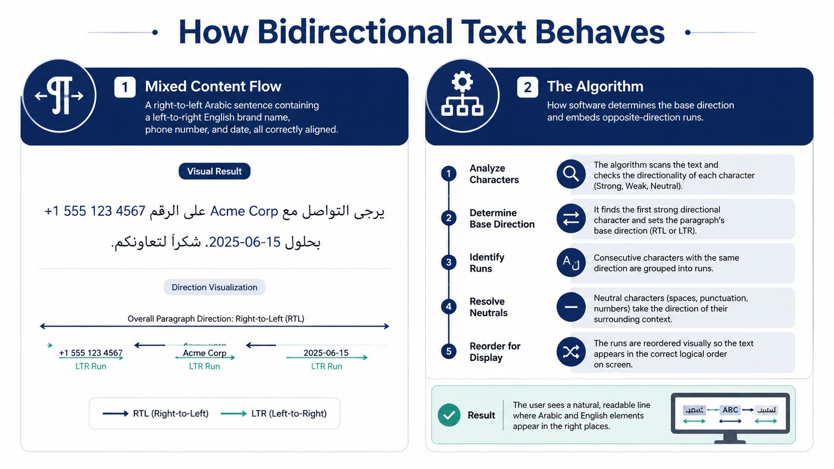
Mixed text is where most products break. A single Arabic sentence often contains an English brand name, a Latin acronym, a phone number, or an address. Those pieces don't suddenly stop being left-to-right just because they sit inside an RTL paragraph. The Unicode Bidirectional Algorithm exists to decide, character by character, how those runs should display in context (Unicode Bidirectional Algorithm).
An Arabic licence that includes ID 1987654 should not turn into visual chaos. The letters ID still read left-to-right, the digits still read left-to-right, and the entire chunk still sits in the right place inside the RTL sentence. That sounds simple, but it only works when the renderer understands the surrounding direction and keeps embedded LTR content intact.
Why mirroring the interface is not enough
A naive tool often mirrors the whole screen and calls it RTL support. That creates the wrong result fast. Parentheses flip to the wrong side, punctuation lands awkwardly, and an address like St. 12 can become hard to parse because the app moved the entire line instead of letting the script behave naturally.
Bullet points and form labels need their own direction settings too. A label in one field, a value in another, and a note under a table are not one big block that can be flipped as a single image. Each piece needs to know whether it should flow right-to-left or left-to-right, because the visible order is not always the storage order.
Here's the point that trips people up: bidi text is not a visual trick. It's a set of rules for mixing scripts without breaking meaning. If the renderer gets it wrong, the clerk sees a document that looks foreign even when the words are technically correct.
The W3C and ICU material make the same underlying point in different ways, RTL support is a system behavior. If the system doesn't handle mixed-direction text correctly, the document can't be trusted at the counter, at a checkpoint, or in any place where someone has to verify details quickly.
Why Native Script Beats Transliteration
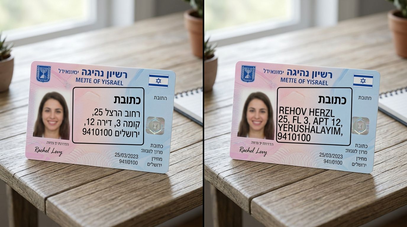
A transliteration can help someone pronounce a name, but it doesn't replace the original script on a document that a native reader has to inspect. If a Hebrew field appears as k'tavet squeezed into a box that was built for Hebrew script, the text may be readable to an outsider, but it's no longer the document the local reader expects. Native script is what makes the content legible to the person who needs to use it in the moment.
Three reasons native script wins
First, the reader on the other side may need the native form. Rental staff, border personnel, and hotel clerks usually inspect documents in the script they know how to read. If the translation is only transliterated into Latin letters, it may sound familiar but still fail to communicate quickly.
Second, layout assumptions break under transliteration. Form boxes, alignment, and label spacing are designed around the width and rhythm of the target script. A line that looks fine in Latin letters can sit awkwardly in a Hebrew or Arabic field, especially when the original document was typeset with those scripts in mind.
Third, transliteration is fragile as a record. Once a document loses its native script output, it's harder to recover the exact form the local reader expects. A translated companion document should help the reader verify identity, not create another layer of interpretation.
What this looks like in practice
An Arabic phrase rendered in native script gives the reader immediate visual confidence. The same phrase in transliteration forces them to mentally convert sounds back into a script they still need to verify. That extra step slows everything down, and in a travel context slowing things down can be enough to stop the process entirely.
For car rentals, police checkpoints, and embassy submissions, native script is the safe output. Transliteration can be useful in notes or pronunciation guides, but it's not a substitute for a translation that respects the script itself.
“If the clerk can't read it at a glance, it's not finished.”
Digital PDFs vs Printed Booklets in RTL
A PDF and a printed booklet can contain the same words and still behave very differently. On screen, the file depends on the viewer's font engine, so a missing Arabic font can turn characters into empty boxes. On paper, the booklet fixes every glyph into position at print time, which means the binding direction, margins, and field positions become part of the final object.
That difference matters more than many expect. A document can look acceptable in a browser or phone preview, then print with labels on the wrong side or signatures floating in the wrong corner. When that happens, the problem isn't the translation, it's the gap between digital rendering and print layout.
Screen and paper obey different rules
A screen view can reflow. A print file can't. That's why RTL layout needs separate checks for a downloadable PDF and for a booklet that will be physically handed over. A right-to-left booklet may need the spine on the right, mirrored margins, and labels aligned toward the right margin instead of the left.
The same source content can therefore pass one test and fail another. An Arabic driving licence preview can look neat on a laptop but still print with the signature panel in the wrong place or with address fields misaligned. The reader at the desk doesn't care why it happened, they only see that the document doesn't line up with the original.
For teams building or checking travel documents, a lot of false confidence appears. Someone opens the PDF, the Arabic text renders, and the review is declared done. That's not enough. The print output needs its own pass, because the final object may be the only version the traveler hands over.
The system requirements checklist for travel documents becomes useful here because it forces the same question in both environments: does the output read correctly where it will be used? That's the only question that matters when a clerk, officer, or insurer is looking at the page.
Five Signs a Translation Is Truly RTL Ready
A translation product earns the label RTL ready only when the whole document behaves correctly, not just the letters. Mirroring the layout is one test, but it's the easiest one to fake. The harder checks are the ones that decide whether a real person can read and trust the output in seconds.
A quick test you can run yourself
- Native script appears cleanly: Arabic, Hebrew, Persian, or Urdu should render without missing glyphs, hollow boxes, or broken letter joins.
- Numbers stay readable inside the RTL line: Digits should remain clear and left-to-right, even when they sit inside an otherwise right-to-left sentence.
- Punctuation lands naturally: Parentheses, commas, and periods should sit where a native reader expects them, not drift to the wrong edge.
- Field labels align to the right side: Form rows, table cells, and headings should follow the correct margin, not just sit inside a flipped container.
- Embedded English still behaves like English: Brand names, acronyms, street abbreviations, and URLs should keep their own direction instead of collapsing the line.
Each of those is a yes-or-no check. If one fails, the document may still look “international,” but it can still confuse the person who has to verify it. A single broken field label or reversed punctuation mark is enough to make the output feel unreliable.
That's why the safest review habit is simple, open a sample and read it like a native user would. Don't scan for the script alone. Read the numbers, the labels, the punctuation, and the mixed-language pieces together, because that's where most failures hide.
Choosing a Translation Product That Renders RTL Correctly
The product question is less about marketing language and more about visible proof. You want to see native script output, bidirectional PDF export, and consistent field alignment across pages. If a service only says it “supports Arabic,” that can mean anything from proper RTL rendering to a font substitution that falls apart as soon as the file contains numbers or English fragments.
A good test starts with a real document, not a sample paragraph. Ask for an Arabic or Hebrew rendering of an actual driver's licence, then inspect the digits, labels, and spacing inside the final PDF. If the text reads correctly but the page margins, tabs, or signature blocks are still left-to-right, the document is only partially ready.
Red flags are easy to spot once you know where to look. Hollow boxes mean fallback fonts failed. Mirror-flipped logos mean the interface was treated like an image. English captions that read backwards mean the renderer handled the whole page as one mirrored object instead of a mixed-direction document.
The multi-language translation services guide is useful here because it pushes the focus onto output quality, not just language count. That's the right lens for travel documents, because the buyer isn't just purchasing words, they're purchasing readability in a specific real-world setting.
World Driving Permit offers certified, word-for-word driving licence translations in 28 languages, including RTL scripts, with digital delivery and an optional printed booklet. If you're checking a licence translation for Arabic, Hebrew, Persian, or Urdu readability, visit World Driving Permit and review the sample output before you decide how you'll present the document.